What makes a “1” different
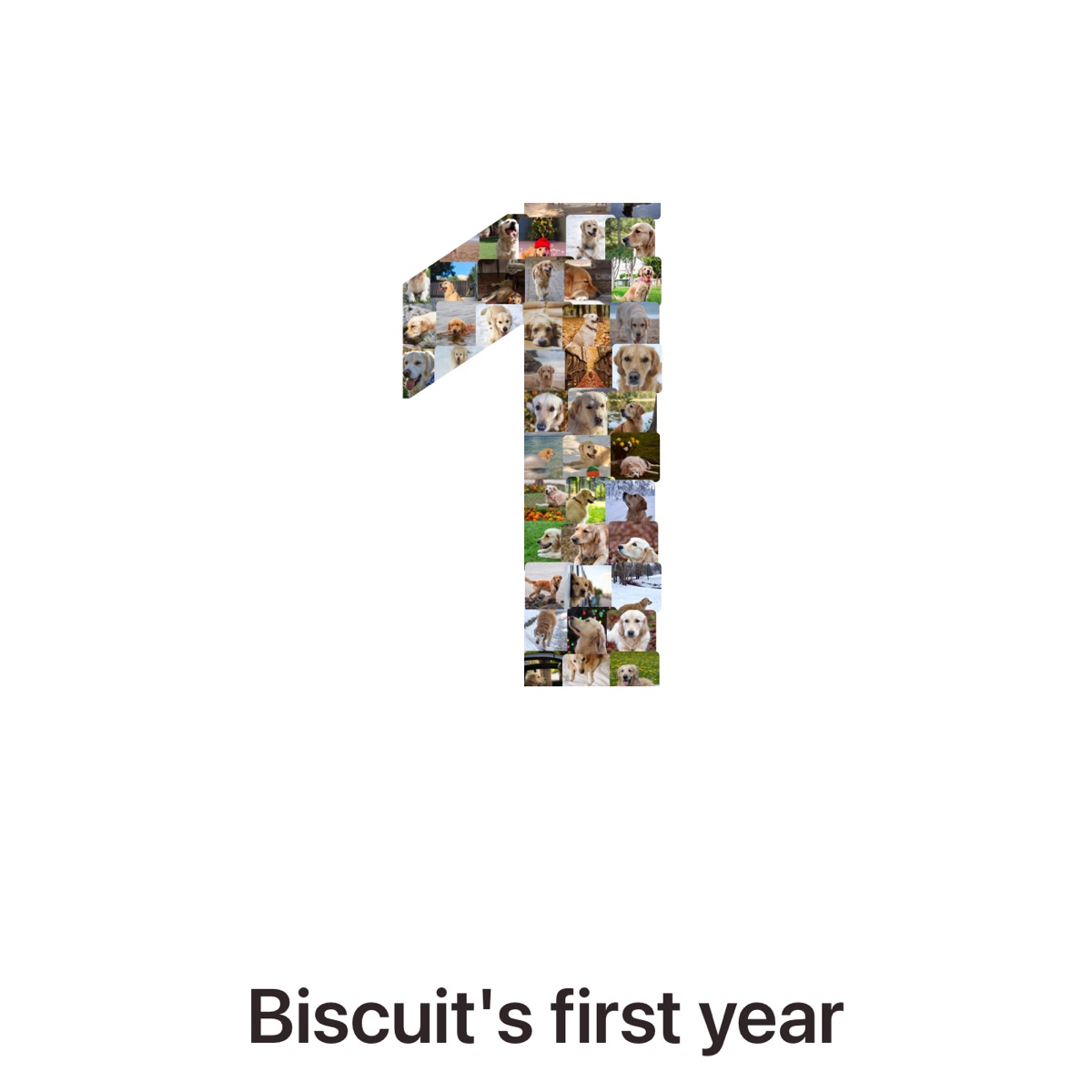
The “1” is a single tall stroke with a short flag at the top. That shape has two consequences. It needs fewer photos, and it looks lost on a square page unless you give it a caption or a tall frame. The example above shows how much white space a lone “1” leaves on a square canvas, which is why a caption line (“Biscuit’s first year”) helps.
Photos to use
- For a baby’s first birthday: newborn photos, first bath, first smile, first food, first steps. One or two a week is plenty; skip near-duplicates.
- For a first anniversary: the first date, the first trip, the move-in day, the ordinary Sundays.
- For a pet’s first year: the day they came home, the first walk, every strange place they fell asleep.
Close-ups read best in a narrow shape. Wide landscape photos turn into texture at this size.
Layout tips
Put the earliest photos at the top of the stroke and the most recent at the bottom, so the “1” reads like a timeline. Keep one of the strongest photos in the flag at the top left; it is the first place the eye lands. If you print it at a party, leave a white border so guests can sign around it.
print sizes for a “1”
| Size | Good for |
|---|---|
| 5×7 | a card or a small frame on the gift table |
| 8×10 | a nursery shelf frame; the most common choice |
| 11×14 | a party sign by the cake, then the nursery wall |
| 16×20 and up | a party backdrop, from a print shop |
Aim for 40 to 80 photos. For a sharp print, the file needs about 300 pixels per inch at the size you print; see how to print from an iPhone. To work out a photo count for your own number and size, try the number collage photo counter.